Findings
The Grave Necessity of Luxury
High homeownership rates, once the crown jewel of Singapore’s third world to first narrative, has come under harsh spotlight lately amidst allegations of affordability. Surging housing prices in Singapore has caused increasing anxiety amongst younger Singaporeans looking to find a new home. Increasingly, news headlines like “HDB resale prices climb 0.6% in August; record 54 units sold for at least $1 million each” are becoming more commonplace in our media landscape.
In Singapore, condominiums (often simply referred to as "condos") are private residential properties developed by private developers, of which units tend to be pricier than those of Housing Development Board (HDB) flats, which are public housing units. Historically, condos have been associated with a certain level of affluence and middle to upper-middle class living. It’s safe to assume that one’s place of residence points towards certain resulting lifestyle choices.
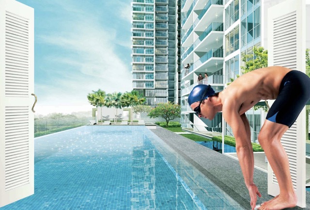
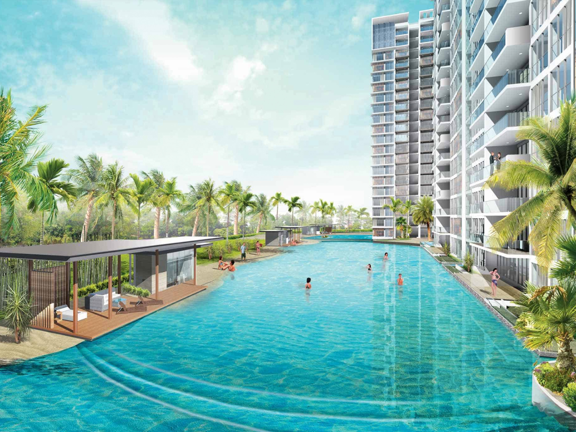
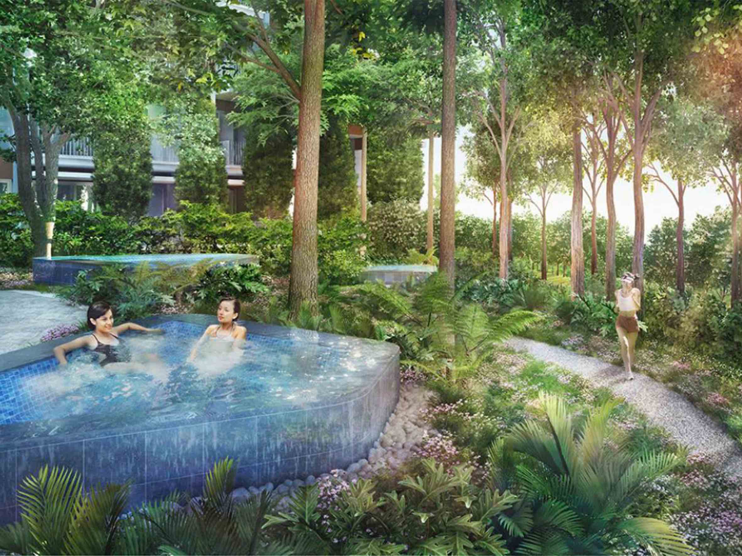
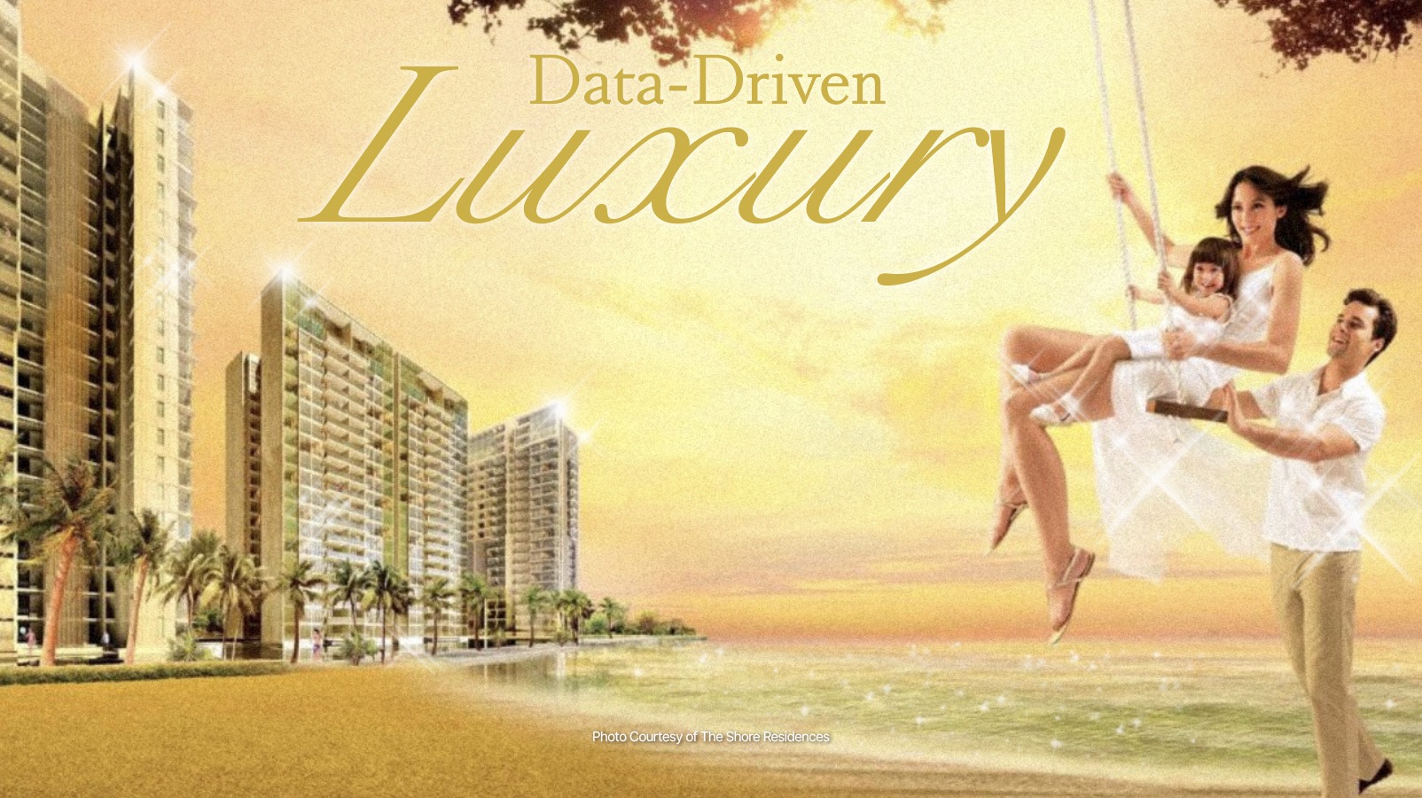
Image Courtesy of The Shore Residences
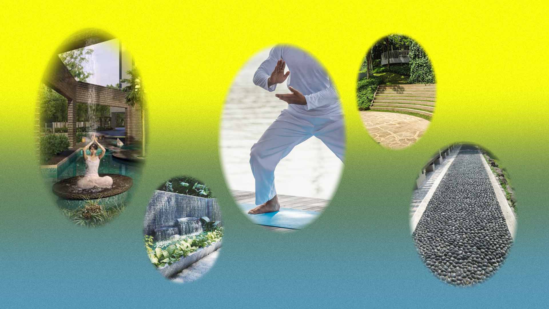
The decision to live in a condo might also be influenced by cultural factors or social aspirations. For instance, some might view living in a condo as a status symbol or as an alignment with certain social circles. Condo facilities like gyms, swimming pools, and tennis courts could also shape or reflect a resident's recreational preferences, for example. From our initial research, our team observes a pattern across branding and marketing for condos — pointing towards a certain lifestyle of excess.
Between the increasing difficulty of homeownership and the absurdity of condo promotional materials, is there a disconnect between developer’s perception of potential homeowners’ desires and the reality of homeownership?

Objective
The ideal result of this project is to discover and observe the shrouded elements of Singapore condominiums which further reveals many other interesting data related to the condo infrastructure and its inhabitants. We chose to collect the information of the condos to understand the significant trends or patterns from each district and the socio-economic position of the condominium as well as the perceived desires and expectations of condo residents in Singapore by the developers of the condos.
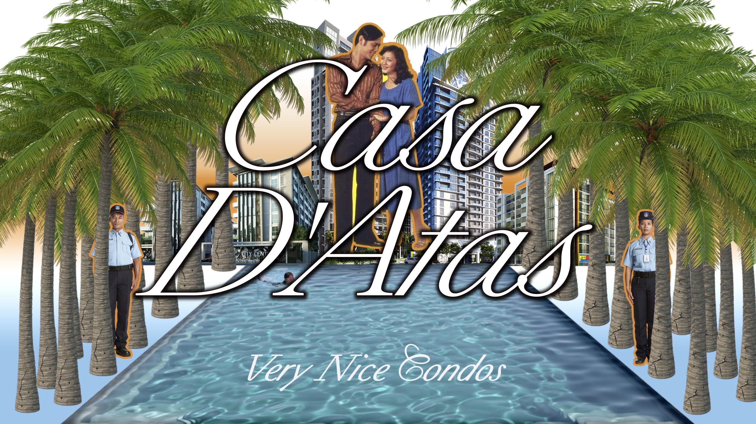
Ultimately, Casa D’atas is a project that aims to peel back the curtains of Singapore’s condo culture through a humorous approach, using satire as a tool to present the absurdity of perceived luxury and compel the audience to reconsider their relationship with excess.
Design Approach
1. Hopeful Aesthetics
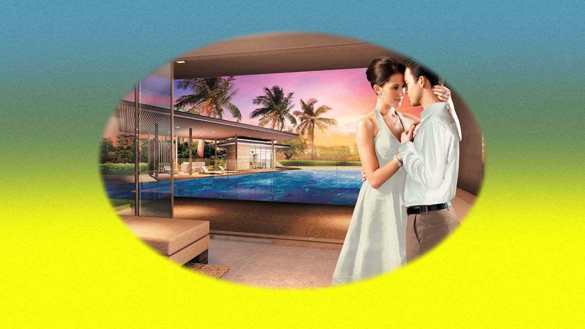
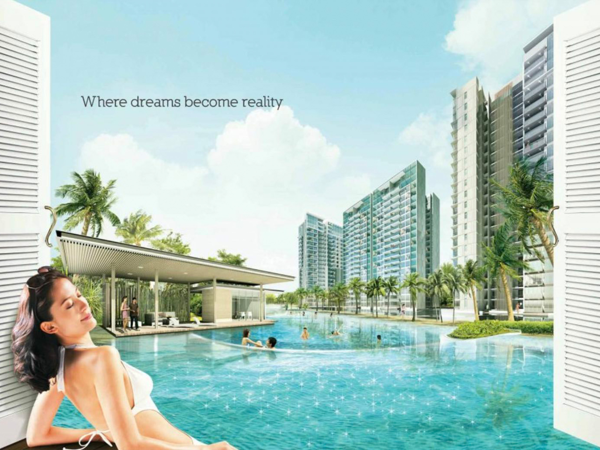
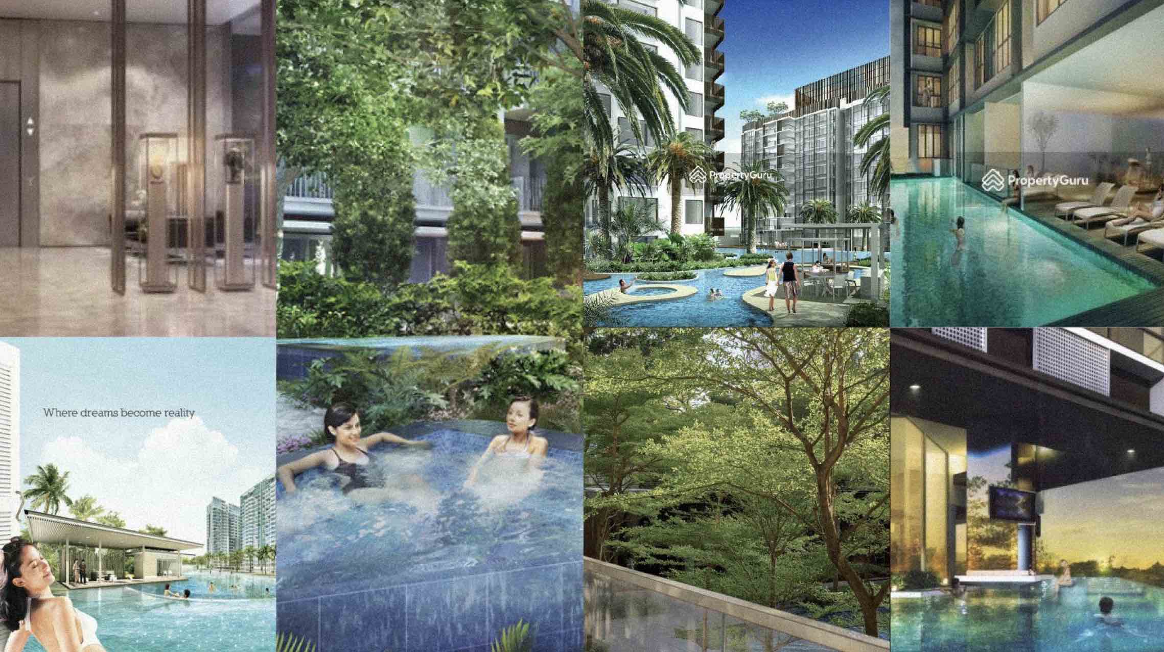
A lot of condos seem to be stuck in the early 2000s in their marketing visuals, sticking to pristine shiny renders, always rendered in the same manner, stock images of people enjoying the facilities, sometimes rendered badly.
These glossy, unrealistic renders are used to present an idyllic lifestyle, to put the viewer in the shoes of someone living in the condominium.
We observed an influence from early internet aesthetics, during the turn of economic prosperity, hope for the future, hope for better living.
We theorise that this era's aesthetic coincided with the rise of digital design production methods, which allowed condo developers to adopt this aesthetic for marketing materials. This eventually cemented the "condo marketing material" look.
We embraced this aesthetic as a way to integrate stereotypical "condo aesthetics" into the project. An exaggeration of this aesthetic also serves to convey the absurdity of such promises of luxury.
Hopeful 2000s Internet Aesthetics
Condo Marketing Images
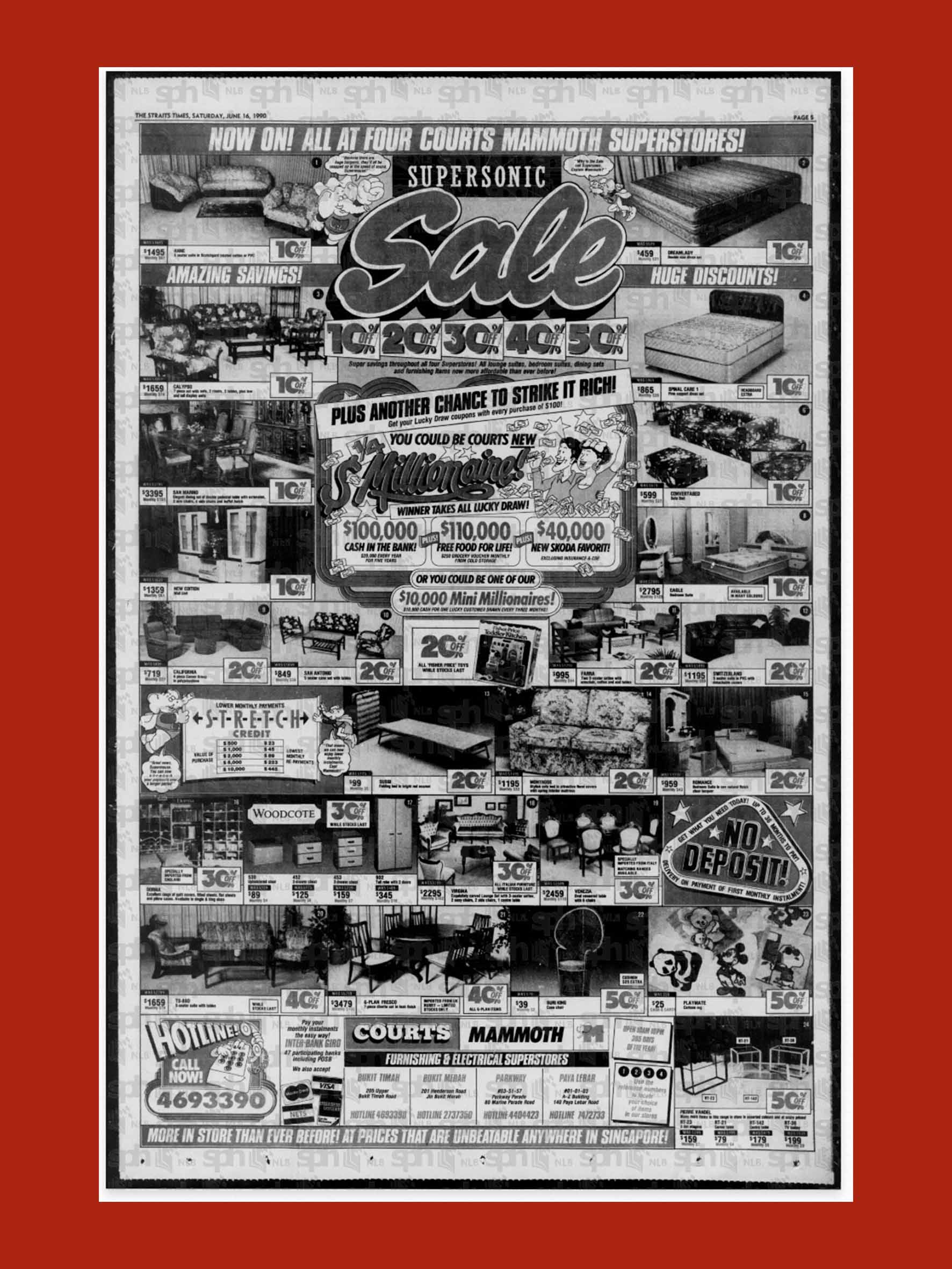
2. Old Singaporean Ads
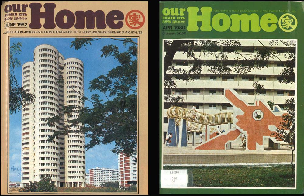
In the effort of harkening back to a hopeful past, we thought about incorporating elements of old Singaporean advertisements.
This also places the audience in a different "time period" from the present, creating a sense of disorientation and separation from actual condo material.
Elements we wanted to extract from these are, for example, old images and typography styles from old commercial ads.
The eye-catching typography served to convey a sense of "BUY ME BUY ME!!", similarly to condo advertisements and their hyperbolic proclamations to entice potential homeowners.
Old Advertisements and Posters
3. Stock Maximalism
Big Condo Marketing is no stranger to the use of stock photos, and it makes sense! Stock photos are generic enough to be used for marketing purposes of all kinds.
Unfortunately, this is also paralleled in the condos across the board looking similar, both in marketing materials and the actual condos.
We decided to use a similar approach to populating our visuals with stock images to capture the same "generic" imagery.
BUT, in the spirit of satire, we wanted to exaggerated this imagery by incorporating elements of maximalism.
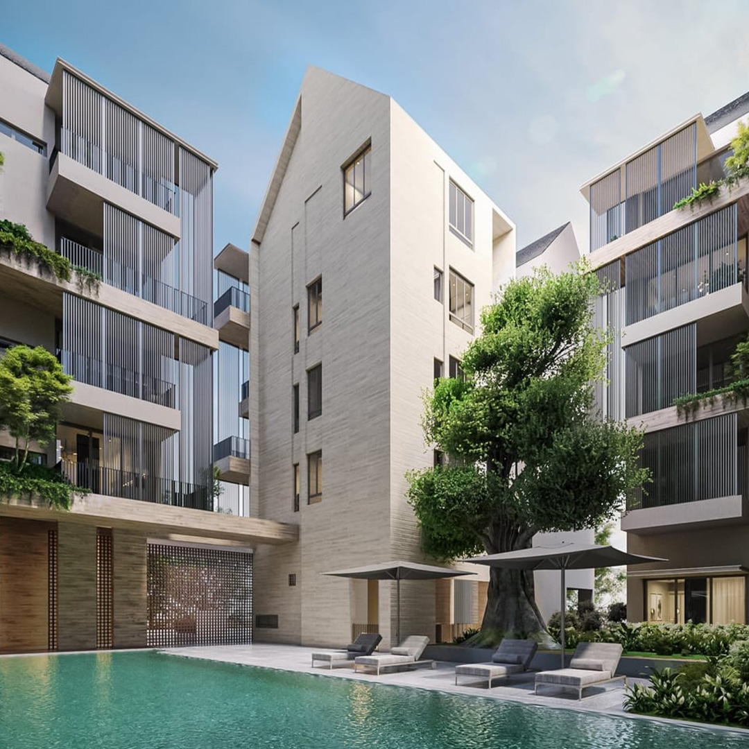
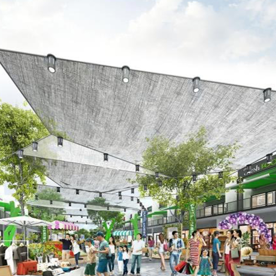
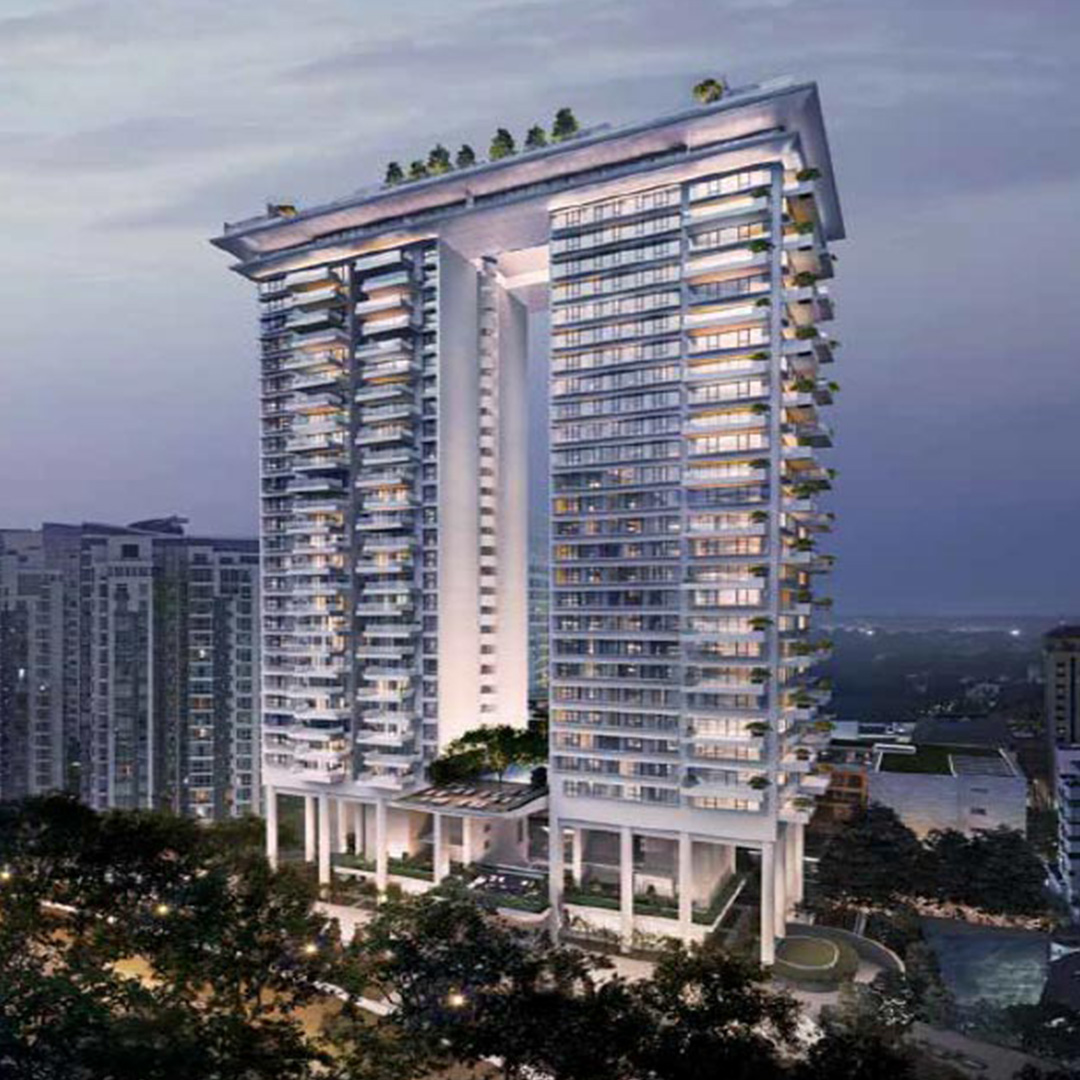
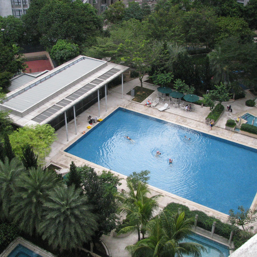
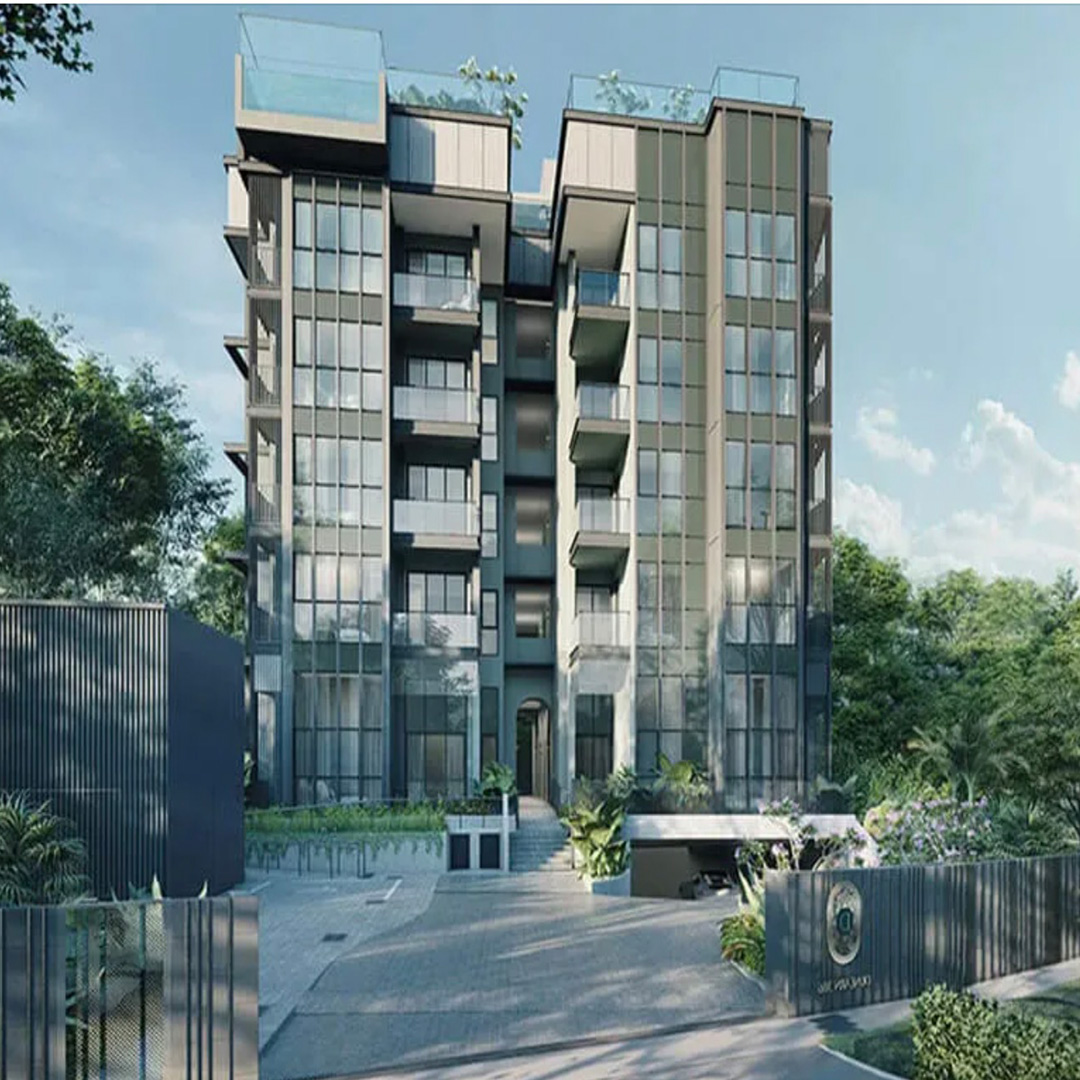
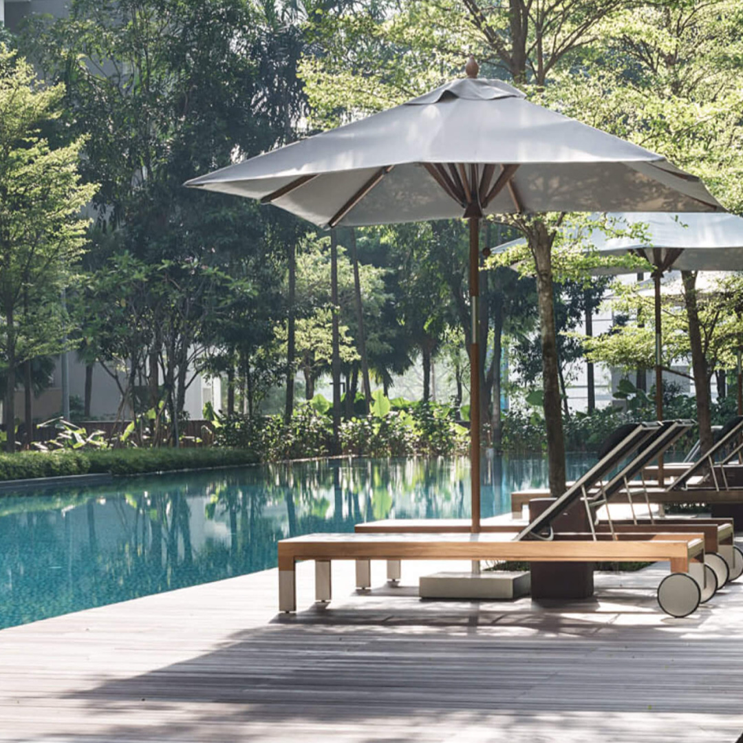
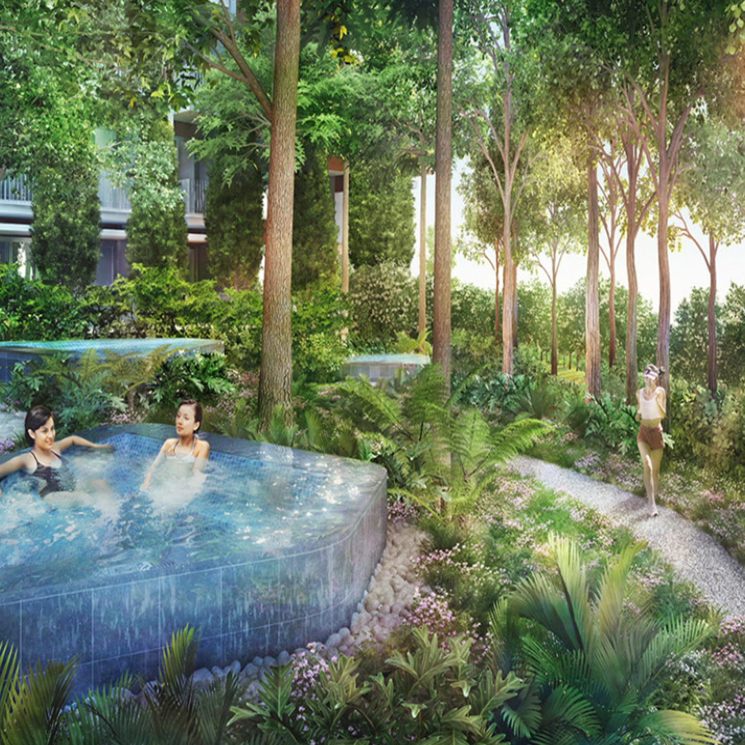
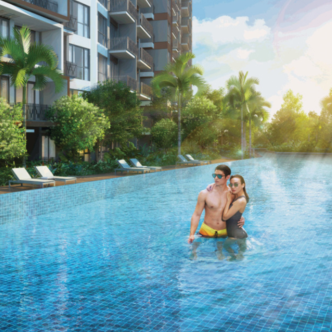
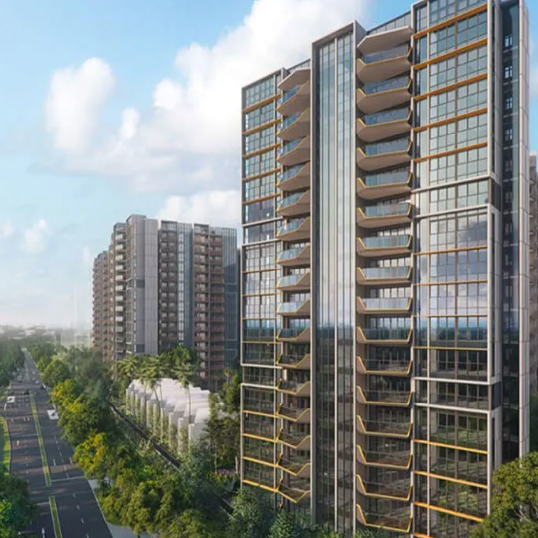
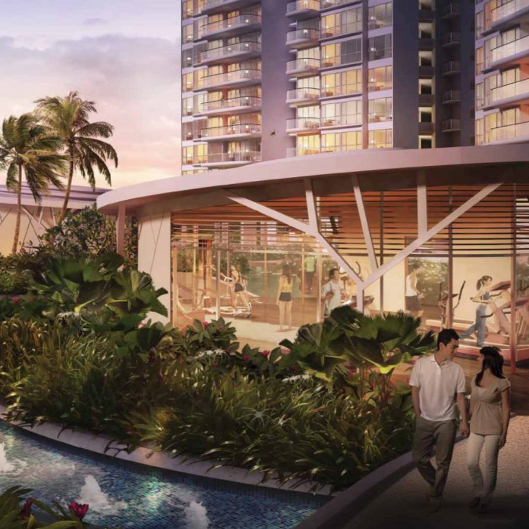
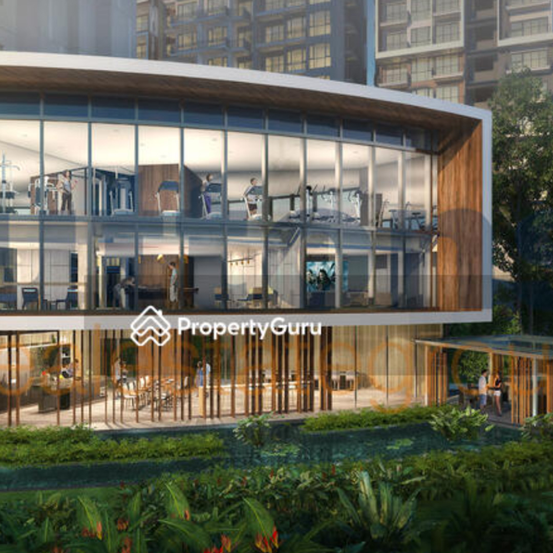
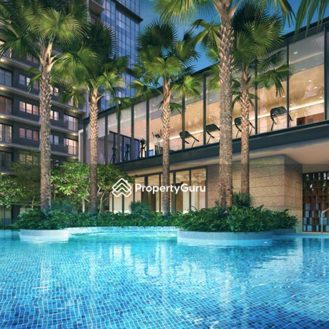
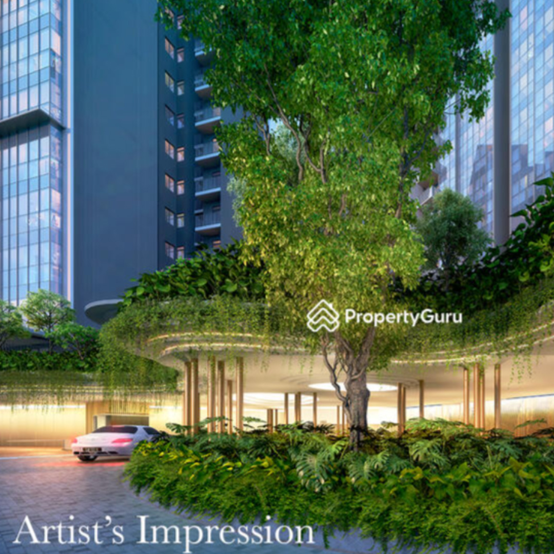
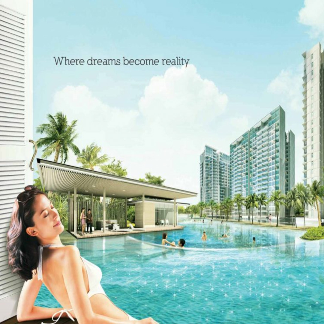
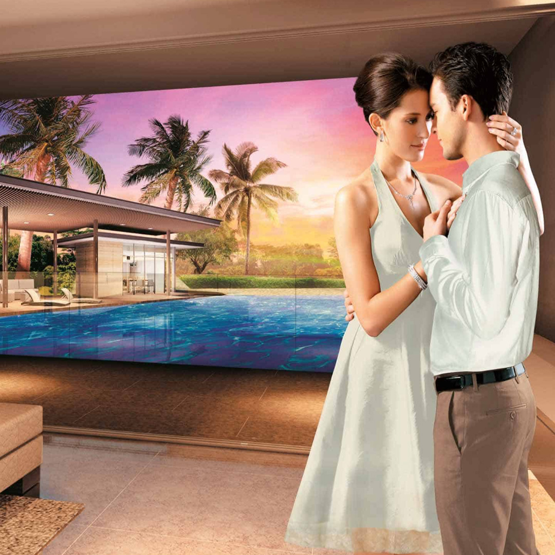
The same condo over and over and over again...
Badly Photoshop Stock Images in Marketing Materials
To capture the excess of condominiums (amenities, cost, services etc.), we decided to incorporate
maximalist visuals into the art direction of the project. This would hopefully convey a feeling of
overwhelm and, well, excess.
Through this approach, we aim to urge the audience to question the
necessity of such excessive
luxury.
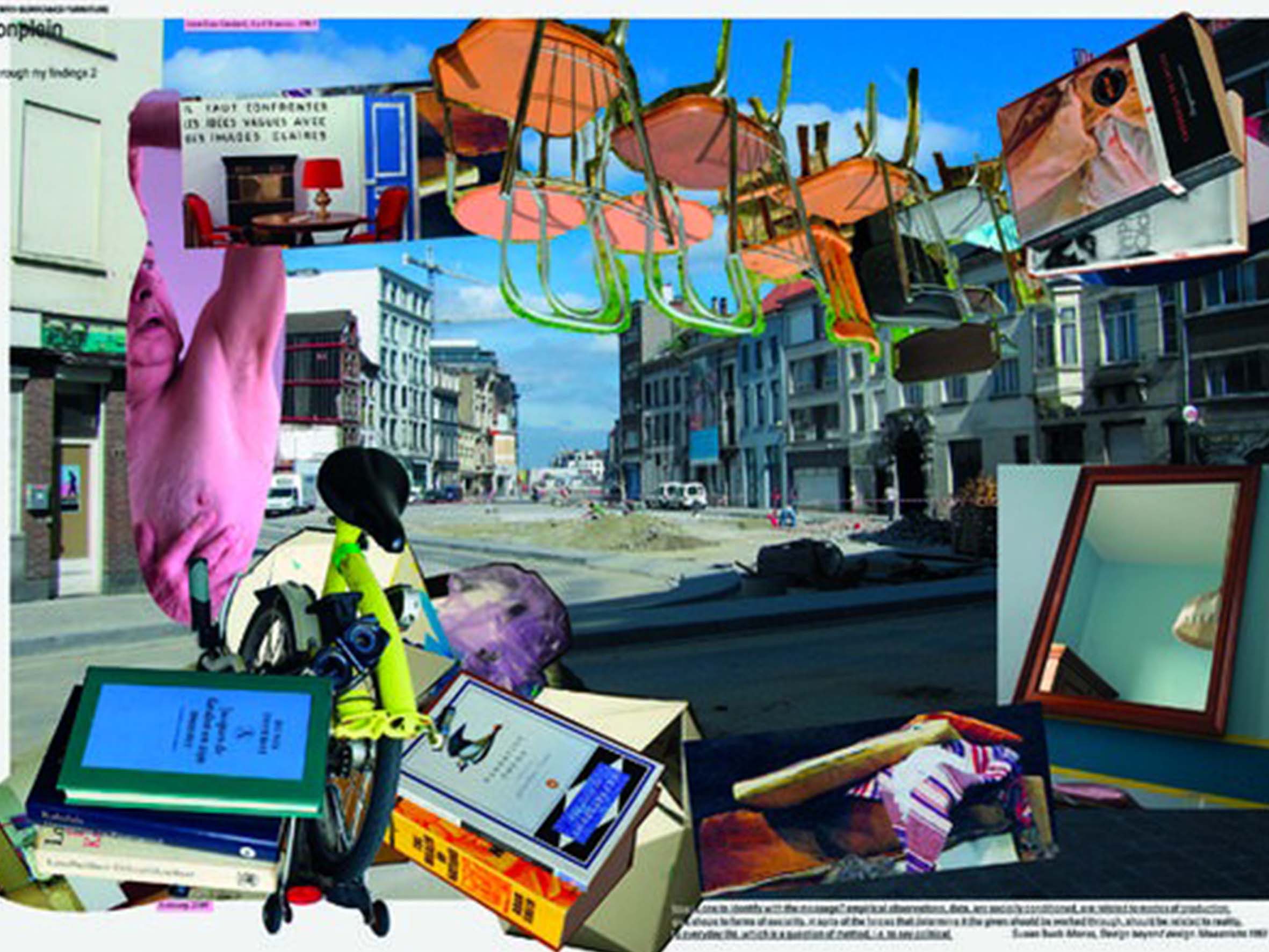
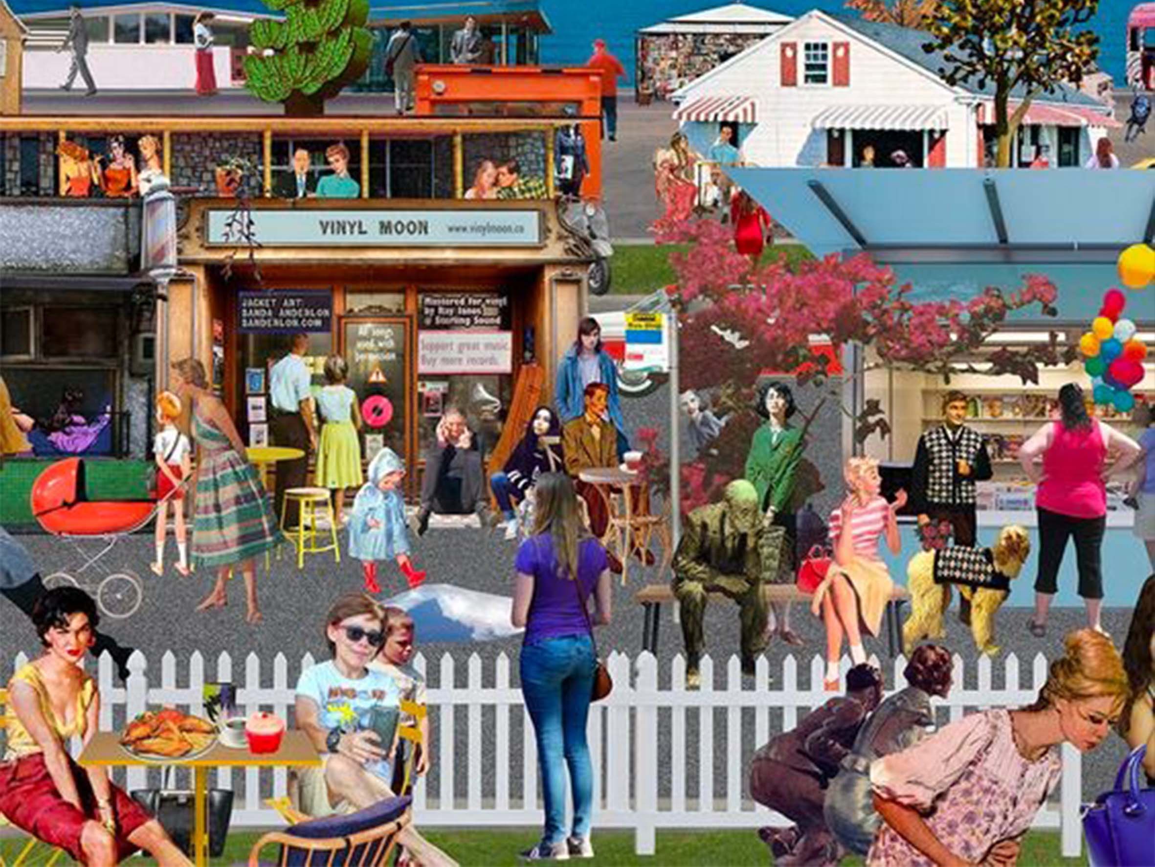
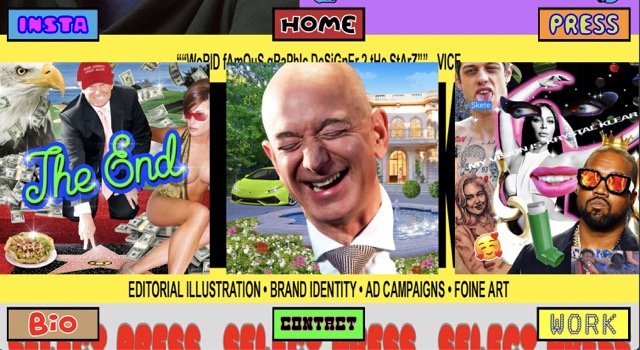
One of our inspirations for satirical design commenting on themes of commidification and capitalism is Ryan Haskins. His work oftens sees humorous maximalist collages of subjects from American pop culture, honestly so tacky it's become camp.
Challenges
1. Humour!
We knew this was going to be hard to do. Humour is subjective, and it's hard to be funny to everyone. Translating humour into design? That's another level of challenge altogether.
Along the way, we realised we had to define the type of humour we wanted to convey in the visuals and copywriting.
There was a line to toe between funny, and not funny. We had to find an anchor to start our copywriting direction before we could turn it on its head.
Our copywriting founds its anchors in the marketing collaterals we observed while collecting the data.
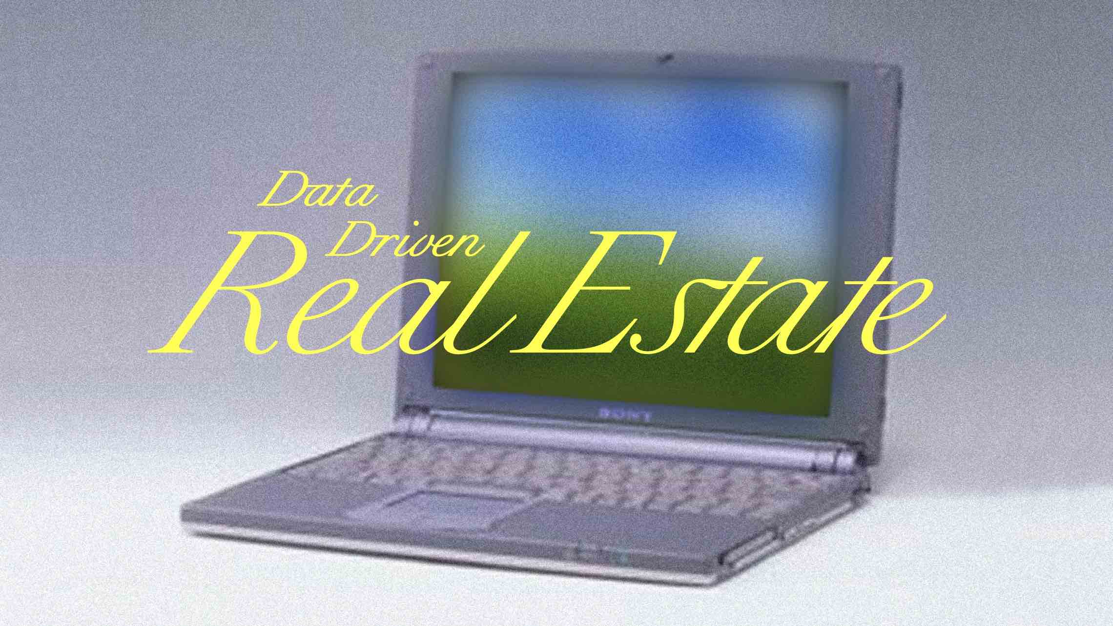
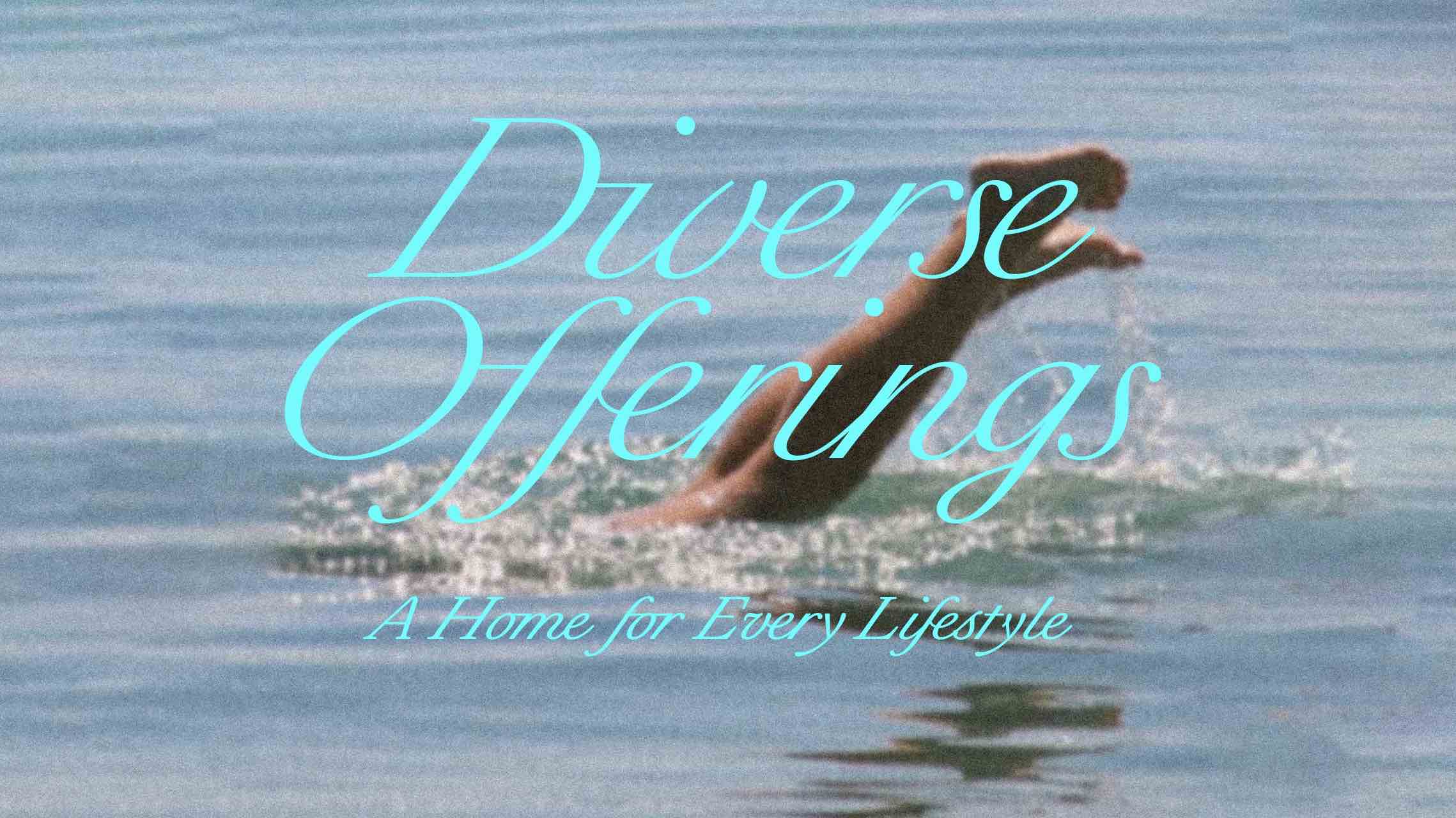
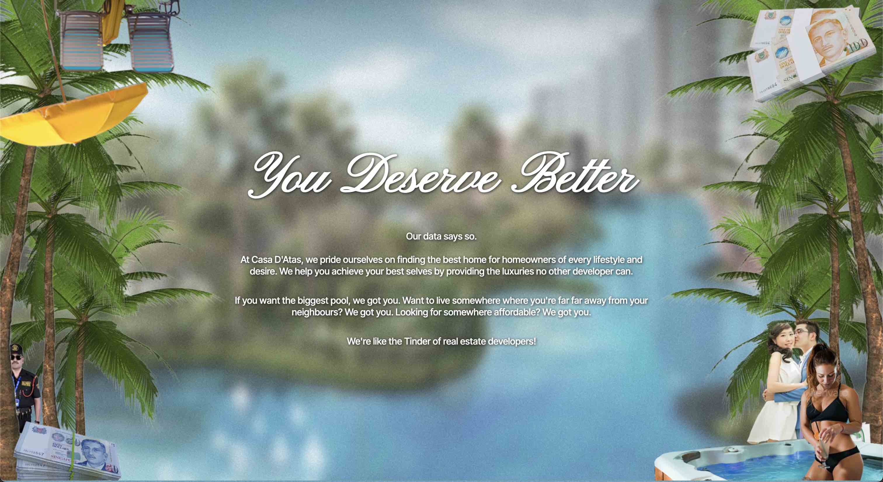
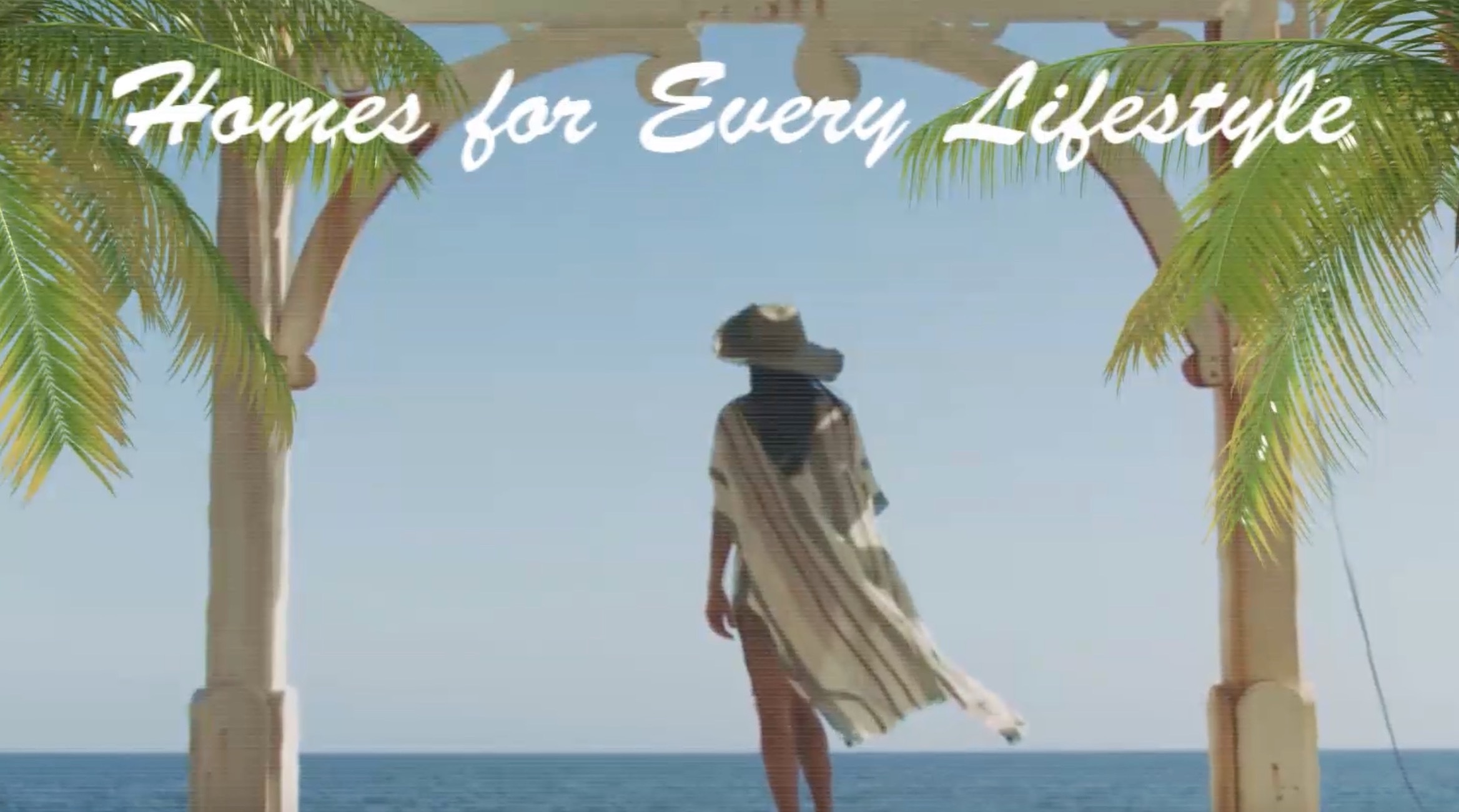
Phrases such as "It's Easy to Forget Your Living in the Heart of the City" (Hilltops Luxury Apartments), "Start your day with a hundred trees, end it with a thousand memories."(Hundred Trees) are cheesy, but promising enough to work for the audience.
We use this same approach, but add some snark, some sarcasm. Who knows, maybe unsuspecting visitors might give us a call to enquire about a house.
2. Data to Funny
Conveying humour in visuals was another challenge that we faced. Again, there was a line to toe with absurb maximalism and just, messy.
Picking the right visual elements (objects, people, environments etc.) was also crucial to conveying the message for the page.
Example 1
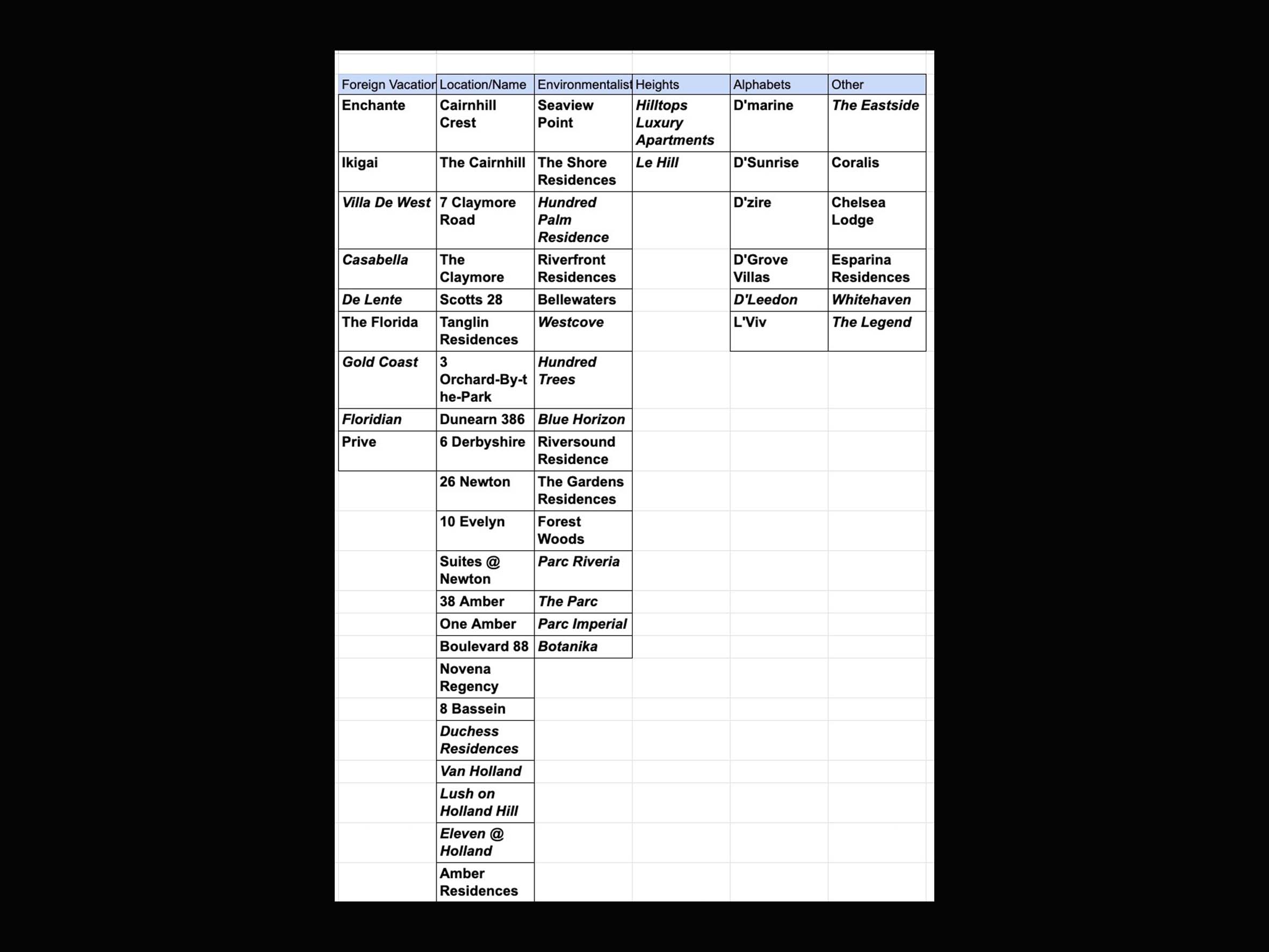
After separating the condos into their categories, we needed to think of how to present them.
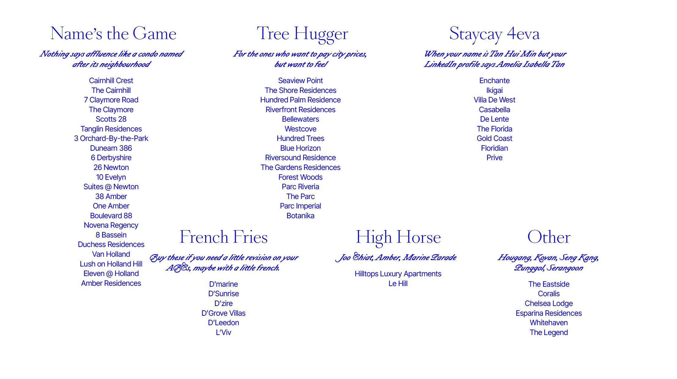
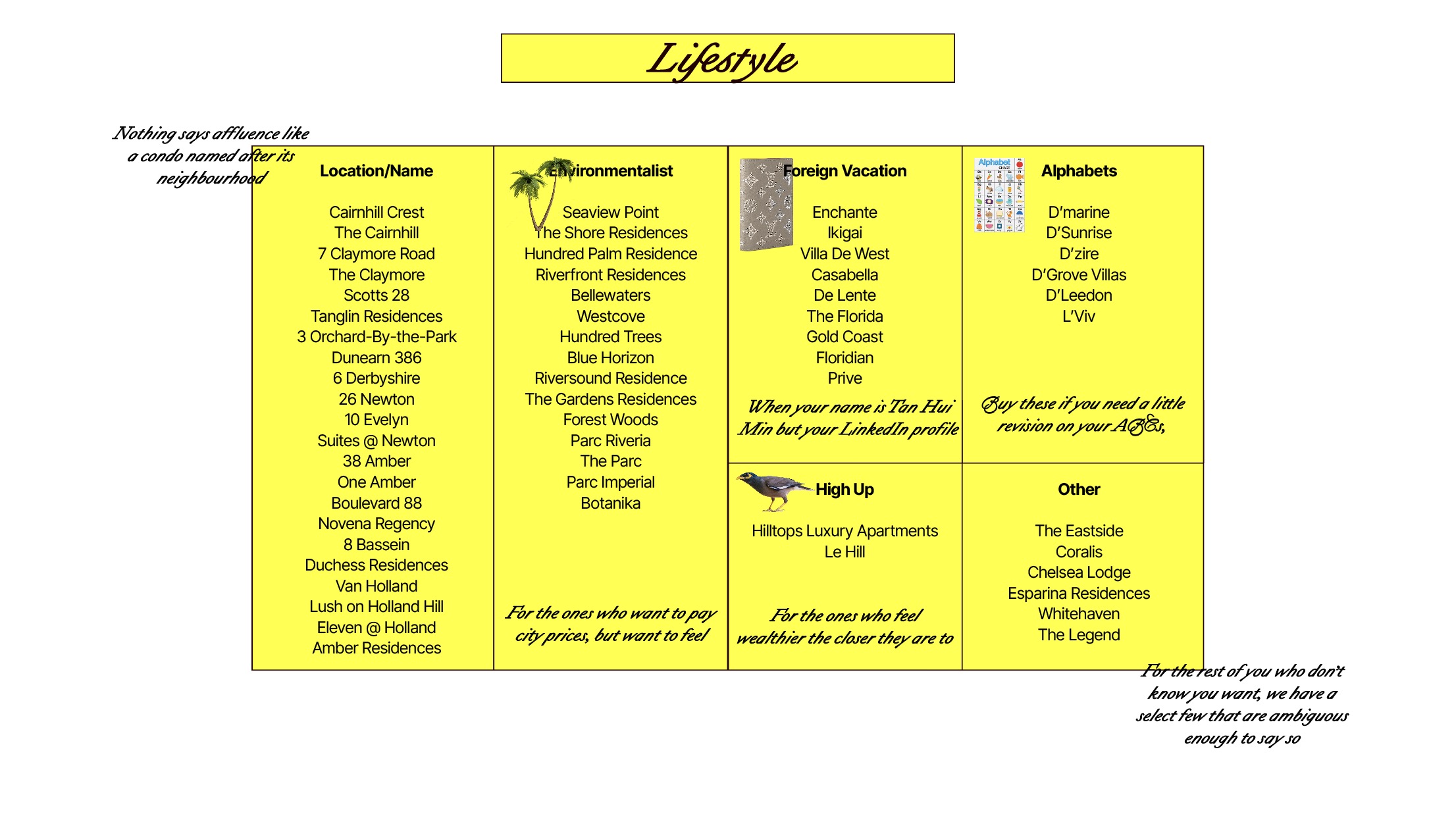
Condos sorted by names/lifestyle
We attempted to put them into tables, but this did not convey the sense of absurdity that we intended. It took us a while to come up with a way to creatively/unexpectedly present the data.
We figured it took an extra push in the ridiculousness of the visual in order to convey the satire.
Initial attempts at Data Visualisation
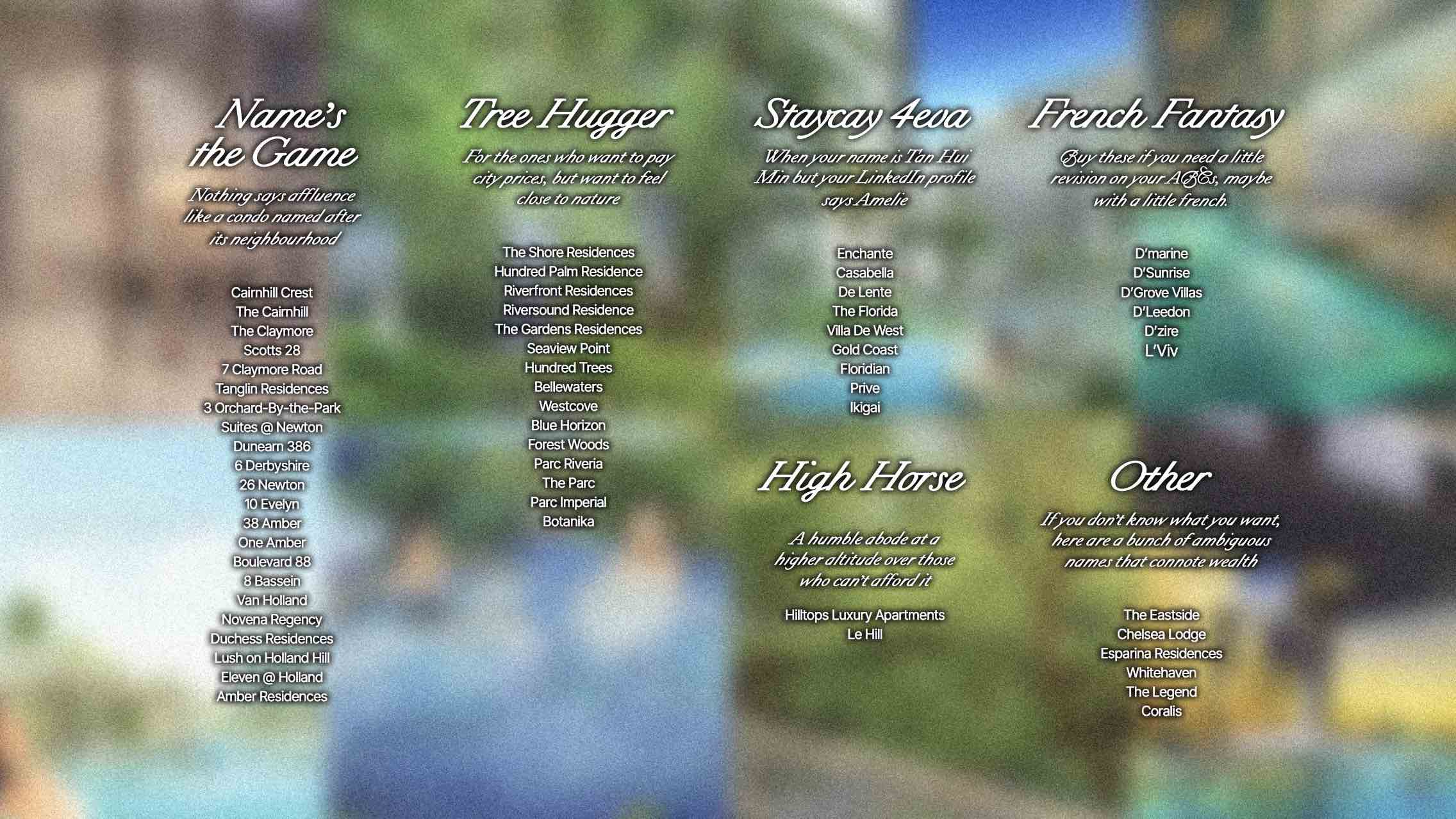
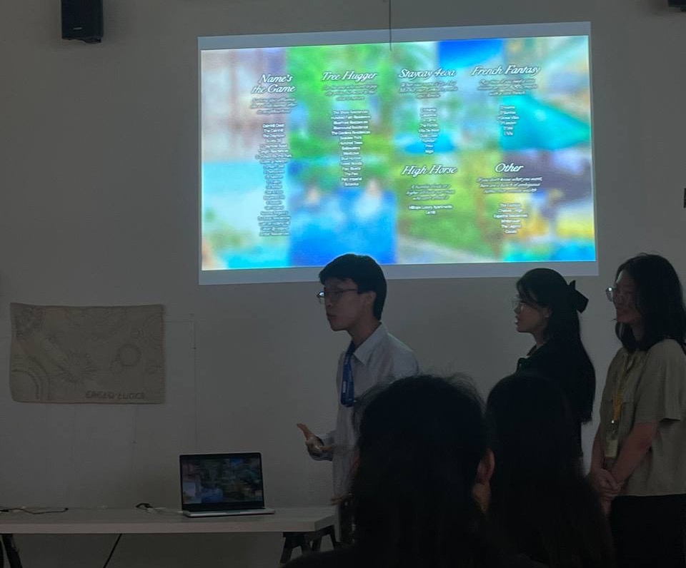
While the categories needed to be presented in "table form" to actually be legible, there needed to be something else to double down on the point we were making. Which was, "So many different marketing styles, but the condos all look the same".
So, we created a blurred background that would be revealed in the next slides — a grid of condo images that we collected that looked pretty much the same as one another.
In the presentation, this was further supplemented with comedic timing that punctuated the message we needed to deliver.
Presenting the Categories
Juxtaposition of promised lifestyles with generic reality of condo
Example 2
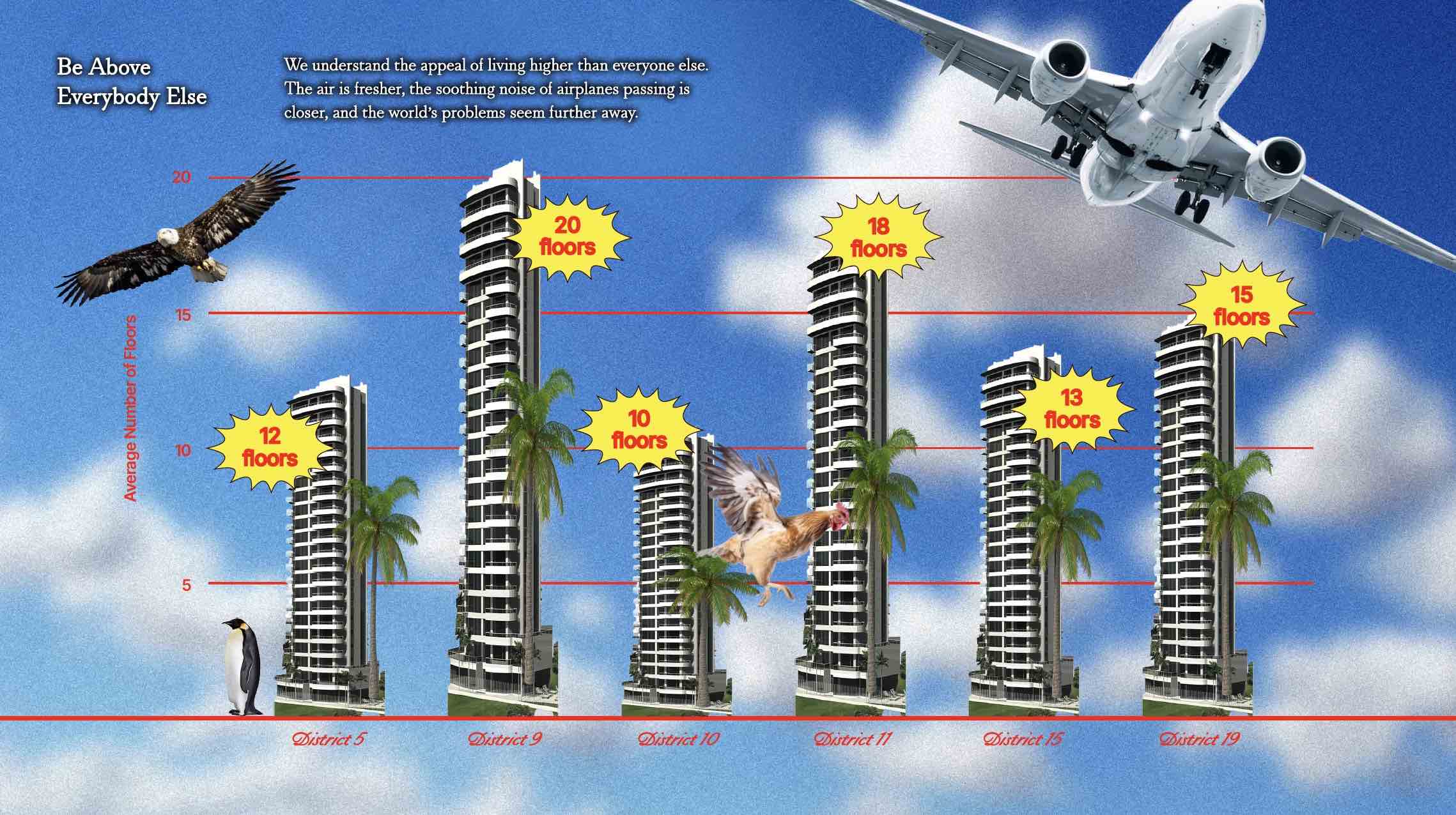
After calculating the average values (no. of floors) for each district, we generate a bar graph to visualise the data. NOW WHAT? We needed a way to present this bar graph so that it suit the visual direction that we set for ourselves.
This was when we pushed the boundaries of absurdity in the design by creating the maximalist approach.
Average number of floors for each district
We eventually identified a few elements to consider. The background, the graph type (bar, column etc.), the subjects.
In this slide:
- Background: Sky (to convey the absurdity of living high for the sake of it.)
- Graph Type: Bar Graph (Cuz... well, height.)
- Subjects: Stretched buildings, various flying/non-flying objects which fly at different heights.
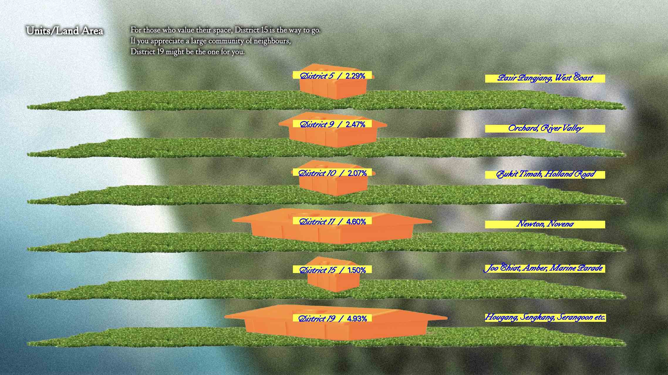
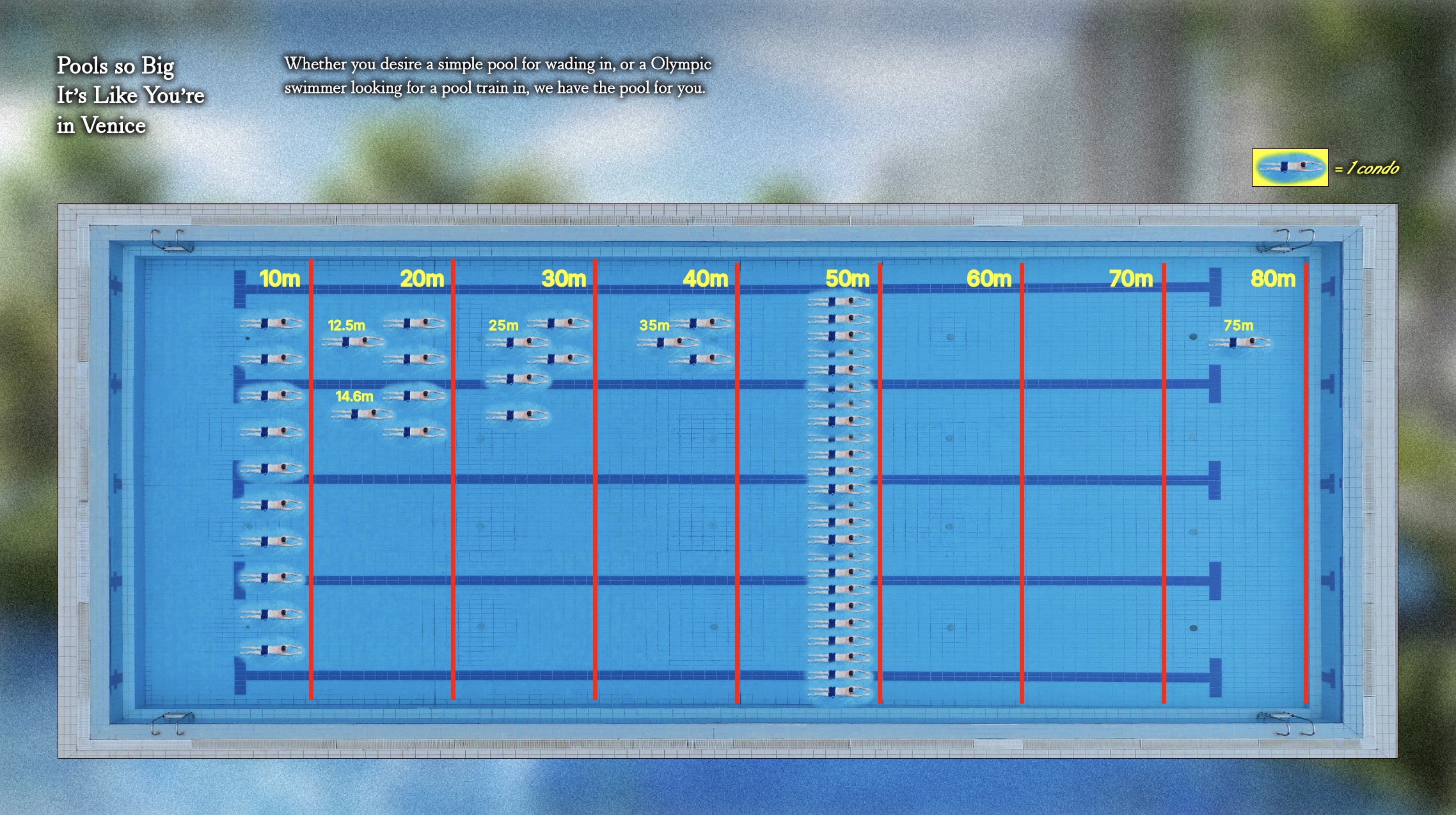
The rest of the data visualisations took a similar approach.
Example 3
We struggled with finding the balance of how much of the condo vernacular we should adopt.
There
was a line to toe between looking EXACTLY like a condo collateral, and something born out of satire.
It
took a little time but eventually, after much experimentation, we were able to come up with a unique
visual language for our project.
Where it started
Where it is now
3. Technical Difficulties
In creating the website and the quiz, we faced some difficulties in creating the artefacts.
Website
In our initial attempt to create the website, we opted for efficiency by using Figma to design the interface and then attempted to transfer the HTML code directly to Visual Studio.
However, we encountered compatibility issues as the coding methods varied significantly from what we learned in our coding classes. Sticking with Figma would have limited us to a preview website, requiring users to download the Figma app for a complete view.
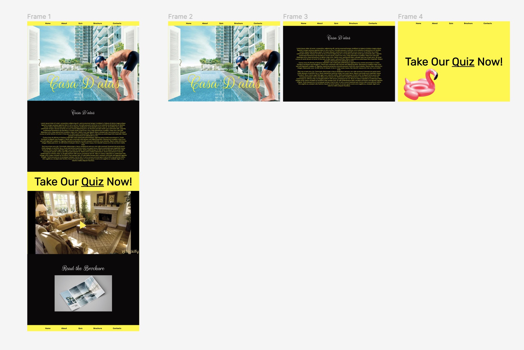
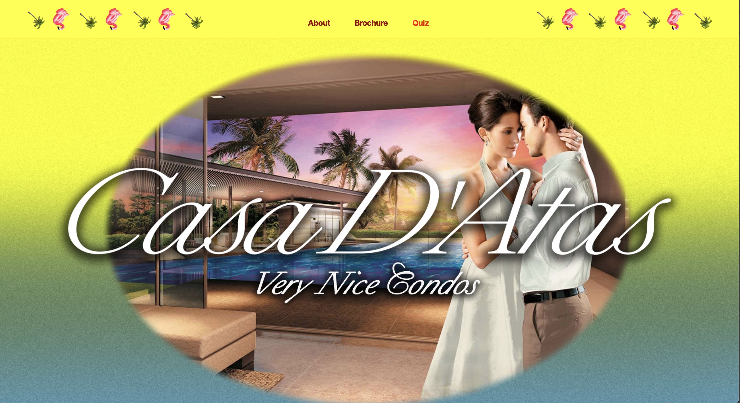
Subsequently, we decided to switch to Visual Studio for creating our website using HTML and CSS. Starting from scratch, we established the website layout with a color box and progressively incorporated images, details, and designs.
Quiz
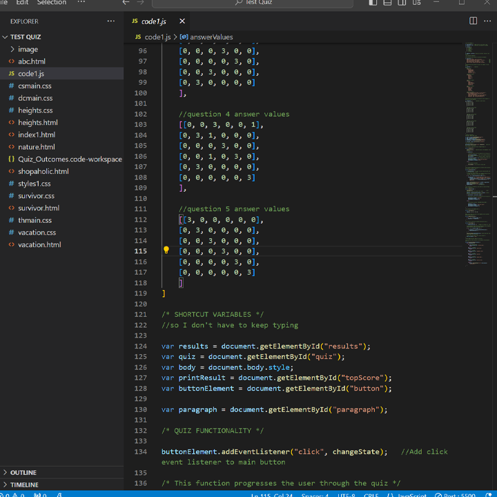
Our initial idea to put images as options had to be compromised since we did not have much experience in Javascript. This was one of many trials and error while editing the Javascript code to make it work for our quiz structure.
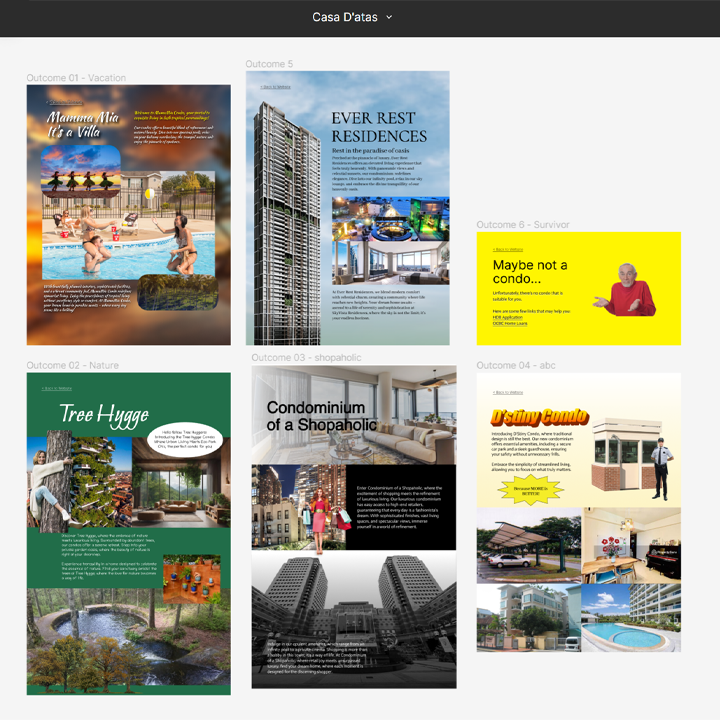
It was also a challenge to come up with 6 different outcomes with each distinct styles.
Feedback
The overall feedback from peers and lecturers were positive! (Phew...) The humour was well-received, and the visual direction served its purpose — to convey the excess through maximalism.
The only thing pointed out was that the performative aspect of our presentation should be documented as part of our artefact. The delivery of the data visualisation was the nail in the... construction site that allowed the message to be fully delivered to the audience.
This is something we intend on working on, through a video presentation of our website, quiz, and e-brochure.
Achievements
Overall, we were happy to be able to fulfill the challenge of translating numbers and data into humorous visualisation with a message!
I think we were all worried at the start because humour is such a difficult thing to capture, and we didn't want it to make it seem like we were making light of serious matters like the housing crisis.
It was important to us that the tone of our project focused on poking fun at the absurdity of luxury, and compel the audience to rethink their idea of luxury as a necessity.
